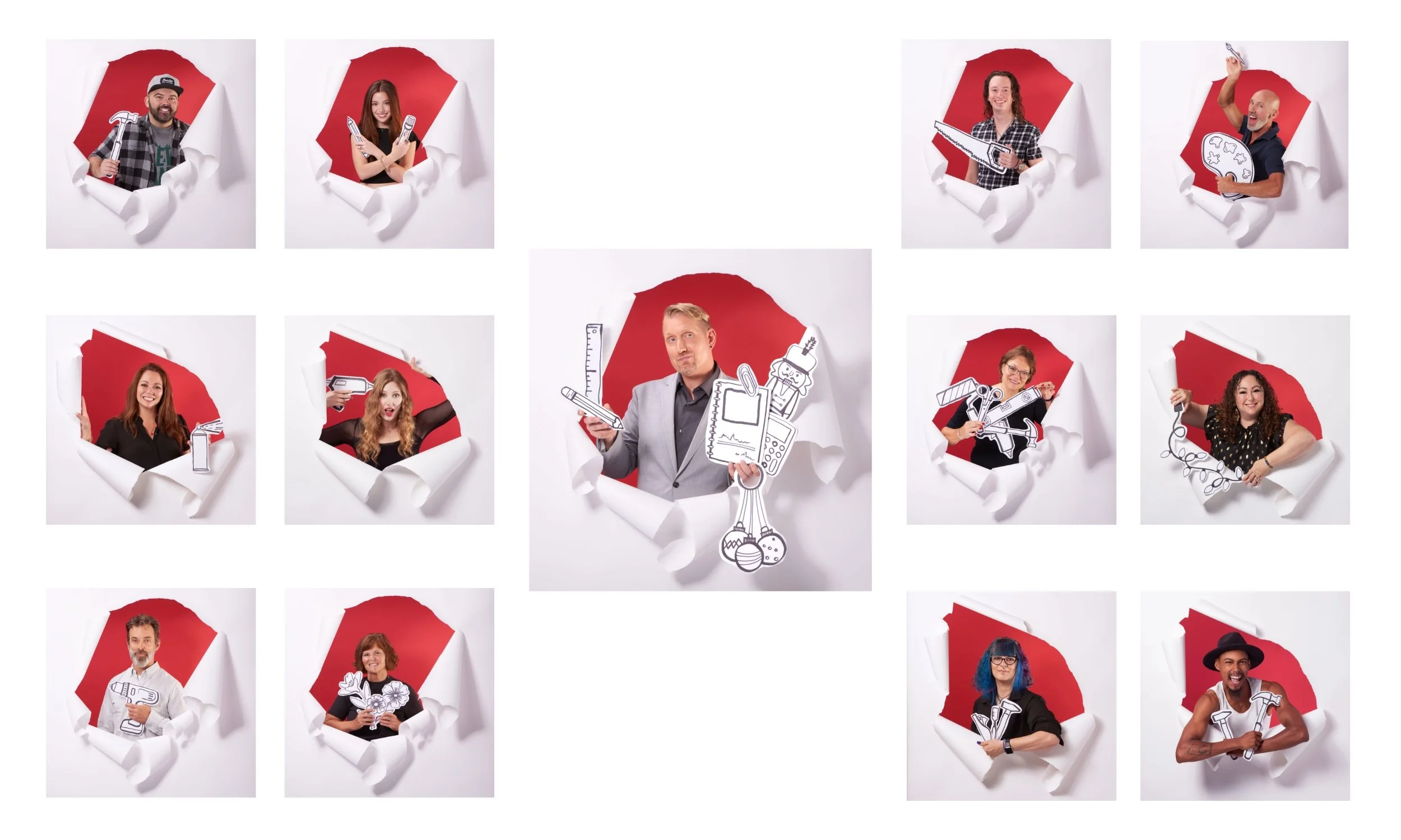
Shaman’s Choice — Building a Ritual-Driven Visual Identity
Shaman’s Choice needed more than better product photos.
Shaman’s Choice came to us to help define the visual direction of the brand. While the product line was established, the imagery relied on product-on-white shots and AI-generated lifestyle visuals that lacked consistency and authenticity. The goal was to create a cohesive, grounded visual identity that could carry across every touchpoint.
The Challenge
Shaman’s Choice came to us without a defined visual identity, looking for guidance on how the brand should feel and present itself.
While the product line was established, the visual side of the business relied on product-on-white imagery and AI-generated lifestyle content that lacked consistency and authenticity. The goal was to create a cohesive, intentional visual direction that elevated the brand while staying true to its roots in candles and smudge sticks.
This wasn’t about refining an existing look. It was about defining one from the ground up and building a system the brand could grow with.
The Approach
We approached this as a brand-building project, not just a shoot.
We built mood boards, defined the visual language, sourced props, and developed a system based on ritual, not decoration. Every decision was intentional: materials, lighting, color palette, composition, and negative space.
The goal was consistency without repetition.
Different setups, same visual language.
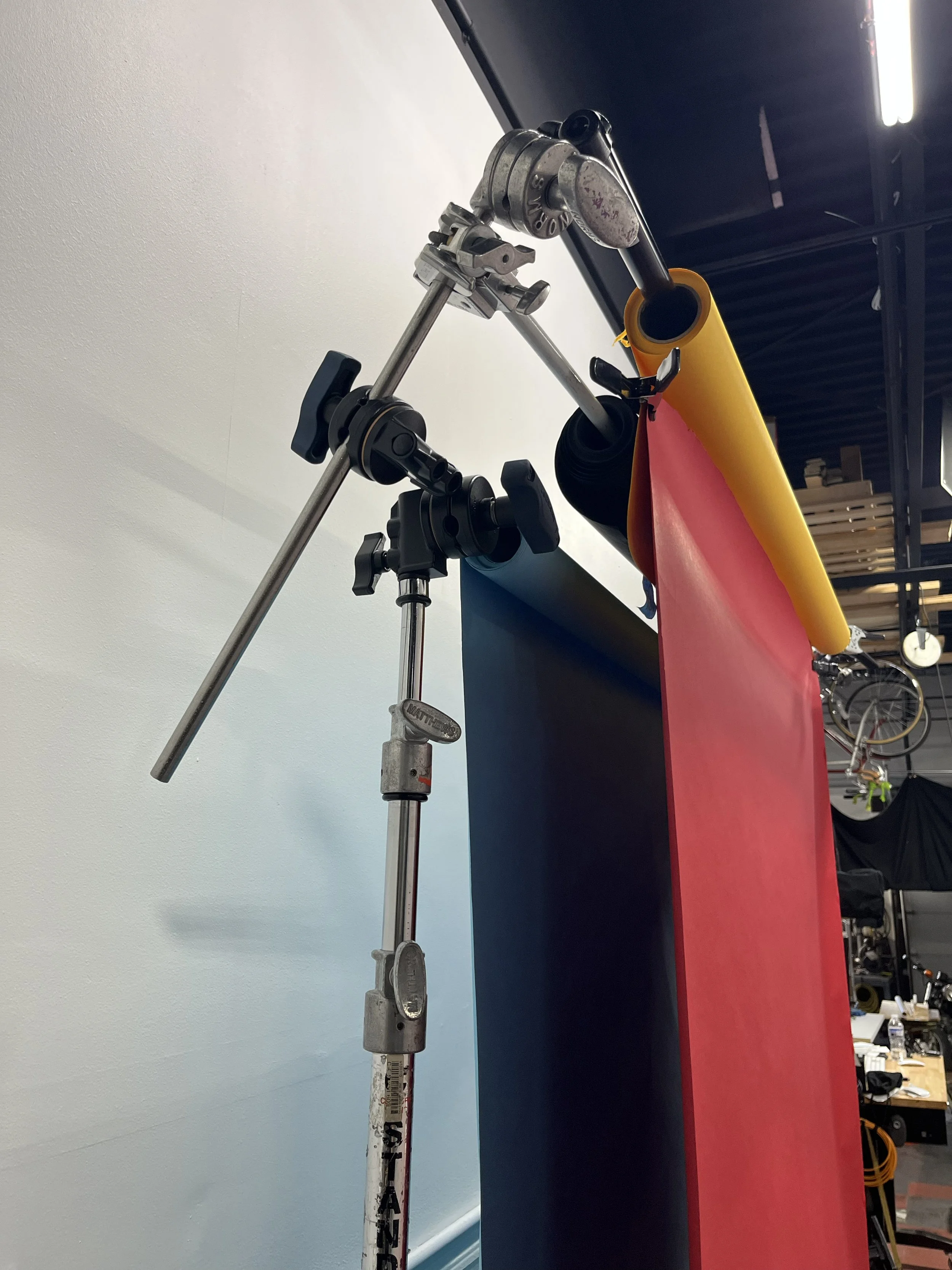
PRODUCTION / EXECUTION
Everything was shot in studio using a flexible system of surfaces and props.
We rotated materials like wood, marble, and stone, introduced elements like tea, smoke, florals, and minerals, and controlled the lighting to maintain a consistent tone across every image.
Each scene was treated as a contained environment, not a styled product shot. The product remained the anchor, and everything around it supported the feeling of ritual, grounding, and intention.
The Work
Instead of producing one-off images, we built a library:
structured product compositions
atmospheric lifestyle scenes
smoke-driven detail shots
multiple variations from the same core setups
This allowed the brand to generate a wide range of content without losing consistency.
The Result
The final work replaced disconnected visuals with a cohesive system.
What started as product-on-white and AI placeholders became a real, tactile, and repeatable visual identity. The images now function across social, advertising, and web, while maintaining a clear and recognizable brand language.c